|
 |
|
|
Every CAD system needs to provide hardcopy versions of circuits. Whether on paper or film, the permanent image is useful for offline consideration and for documentation. Although hardcopy graphics techniques are essentially the same as those found in display programming, there are other considerations. As a first step, it is necessary to understand the nature of these plotting devices.
Like displays, plotters fall into two broad categories: raster and calligraphic. Raster devices such as laser and ink-jet printers cover every pixel on the page and can produce arbitrarily complex images. Calligraphic devices such as pen plotters and some film recorders have a single writing head that must be moved to draw.
Unlike displays, the intensity resolution of plotters is generally low. Many hardcopy devices are strictly bilevel, able only to plot a black dot or to leave the spot white. Color printers have additional sources of ink but can still place the inks with only one intensity. Pen plotters can sometimes fake intensity by drawing over an area multiple times, but there is a limit to what the paper can endure, so these plotters still have only a few intensity levels. Essentially, the variations of layer appearance must be faked with patterned areas.
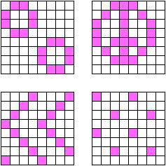
To give the appearance of varying shades of gray, a pattern of black and white dots can be printed. When precise intensity levels are needed, a process called dithering is used; it computes the proper number and placement of these dots [Jarvis, Judice, and Ninke]. In the plotting of VLSI circuits, however, it is sufficient to have a set of precomputed patterns that are associated with the different layers.
Selection of patterns should be done in such a way that the overlap of multiple layers is distinguishable. This overlap is generally an ORing of the bits to produce the union of black dots in all patterns. Therefore the individual patterns should be kept sparse so that overlaps do not become too dense. Since there are IC processes with over a dozen layers, and since as many as half of them may overlap at a point, it is best to be generous in the use of white space in a pattern.
| Another feature of patterns is their gestalt, or subimage, which consists of recognizable symbols in the pattern that help with identification. In Fig. 9.10, the top two patterns are composed of subelements that remain distinct when the pattern is tiled over an area. Users can see these elements on the plot and identify the layers. The bottom patterns have no gestalt since they are designed to abut smoothly, generating a uniform field with a particular density. |
|
Pattern sizes do not need to be very large; they typically range from 8 to 32 bits on a side. The advantage to using a power of two for the size is that, for any coordinate on the page, the pattern element to use can be found by masking the low bits of the x or y value and indexing the pattern array. This has the side effect that the pattern is always positioned independent of the polygon boundary, so that patterns in abutting polygons will merge correctly.
Another issue in hardcopy graphics is the correct duplication of the display when making a plot. Inconsistency between hardcopy and display is a problem that is caused by differences in graphics hardware. The three main culprits are pixel size, text drawing, and color. The ratio of pixel height to pixel width may not be the same on any two devices and compensation should be made to keep the scale right. Also, text that is placed on the screen so that it fits properly may have a different size on the hardcopy, which lessens readability. Finally, color accuracy is very difficult in light of the different methods used to show color. These problems must be solved to produce correct displays.
The CAD programmer should be aware that some displays do not have square pixels. The aspect ratio of the screen can often be adjusted to squeeze or to stretch either axis and make the image square. If this adjustment is not possible, the software must scale the coordinates so that the layout looks right. Hardcopy devices are more difficult to adjust and may have rectangular pixels as a permanent feature. If this is the case, then these devices must also be scaled in software. The important thing is to keep the image in step with the manufactured artifact, which always has uniform x-to-y ratios.
Less significant but still disturbing to the designer is the difference in appearance between text on a display and text on a plot. Typically, the hardcopy is destined to be published, presented, or otherwise preserved and must look its best. The designer may spend much time adjusting the text on the display for maximum readability only to discover that the hardcopy version looks very different.
The problem with text is that most displays have a limited number of font sizes but a continuum of graphics scales. This means that as the circuit zooms in or out, the text will stay the same size. Only PostScript systems allow a true continuum of raster text scales, and they are typically found only on hardcopy devices [Adobe]. On calligraphic displays, text is represented with vectors and can scale continuously, but these displays are rarely used today. An alternative is to describe all text calligraphically and convert it to pixels before plotting or displaying. Although this will scale properly, it will look bad because vector characters must be hand cleaned when converted to raster.
The simplest solution is to choose a range of text scales on each device that correspond in size. This will keep the text right to a small margin of error, and it will look good on each device. Remember also that some fonts are variable width and so their x axis must be adjusted to get the correct scale. A consistent hardcopy can save designers much time at that critical point: when the design is done and the details begin.
A significant difference between color displays and color plots is the nature of color combinations. A display tube emits light and therefore, when multiple colors combine, they are added. The three-color display primaries--red, green, and blue--are called the additive color space because their absence is black and their sum is white.
On paper, color is reversed because ink does not emit but rather absorbs light. This means that more ink darkens rather than brightens, so two colors inked over each other will subtract. Paper plots therefore use subtractive color space, in which the primaries are cyan, magenta, and yellow, the absence of which is white and the presence of which is black. The color wheel of Fig. 9.11 shows how both sets of primaries relate: Green and blue on a display will yield cyan; yellow and magenta on paper will yield red. Notice that these two spaces are inverses in a common space so, to convert colors, these simple formulas are used:
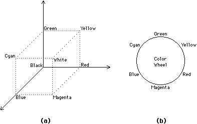 |
| FIGURE 9.11 Color space: (a) A three-dimensional volume (b) A wheel. |
Although these formula appear to be simple solutions to the problem of hardcopy and display color consistency, much more is necessary. Displays can typically use a full range of intensities in each primary color, whereas hardcopy printing is all or nothing. When a dot of ink hits the paper, it fills that pixel with the full intensity of its color. Thus to achieve a range of intensity, it is necessary to paint patterns that have the proper proportion of on and off color. Precomputed patterns do not work as well as proper dithering techniques in this case.
Another hitch in these color-conversion equations is the need to use a pure black ink that is available on some plotters. The sad truth is that when cyan, magenta, and yellow ink overlap, the result is not a black but a dark brown. Since black is desired in this situation, many paper plotters have a fourth ink that is really black. Thus the color conversion must have special code to detect the simultaneous use of all three primaries and replace them with black ink. It is only this four-color-printing process that can reproduce an acceptable range of images.
When a calligraphic hardcopy device is being driven, the motion of the writing head may be of concern. The obvious example is the pen plotter that takes time to move the pen from one point to another. The programmer must ensure minimal pen motion both within and between the graphic objects.
Reducing pen motion within an object simply requires specifying lines in sequence. Thus a square that is 100 on a side and centered at (50,50) should be specified as the lines (0,0) to (0,100); (0,100) to (100,100); (100,100) to (100,0); and (100,0) to (0,0). Although this may seem obvious, it is easy to make the simple mistake of reversing the "from" and "to" coordinates when specifying the lines, which will double the time needed to draw the square.
Reducing pen motion between objects is a much more difficult problem that cannot be solved perfectly. After finishing one object, it is best to draw another that is close. Although this random walk through the image will reduce pen motion in the early stages of plotting, it may cause long jumps near the end when there are only a few scattered objects that remain unplotted. Coherence of drawing is also important because the designer may be watching the plot and will be confused if some objects are skipped for nonobvious reasons. Thus a linear order, imposed as a weighting factor on proximity, produces an image that is drawn more or less from top to bottom.
Pen motion should also be considered when calligraphic techniques are used to fill an area. The optimal motion is a back-and-forth raster scan of the area that leaves parallel lines for a fill pattern. For variation, the lines can be spaced differently, run at different angles, or even make a cross-hatched area.
Another consideration in plotting time is pen changing. This usually takes more time than any drawing operation and occasionally requires motion so that the writing head can get to where the pens are stored. Thus it is best to plot all of one color before moving to the next pen.
|
Previous |  |
Table of Contents | Next | |
Static Free Software |  |