Interactive Visualization
Roassal elements (and Trachel shapes) may react to user events such as mouse clicking, mouse moving and key pressing. Making a visualization interactive is important to enable the following: navigate within a data set, drill-down/up, details on demand without overloading a visualization.
Roassal offers a number of interaction, implemented as a subclass of RTInteraction.
1. Draggable elements and view
Elements may be draggable using the interaction RTDraggable and a view may be draggable using RTDraggableView. Interaction may be set on one element or a group of elements, using the message @.
Consider the following example:
	v := RTView new.
	v @ RTDraggableView.
	es := RTBox elementsOn: (1 to: 20) asArray shuffled.
	es @ RTDraggable.
	es @ RTPopup.
	v addAll: es.

	RTMetricNormalizer new
		elements: es;
		normalizeColor: #yourself;
		normalizeSize: #yourself.

	RTFlowLayout on: v elements.
	v
Interactions may be added at anytime to the element and the view.
The instruction es @ RTDraggable may be located before or after adding the elements in the view.
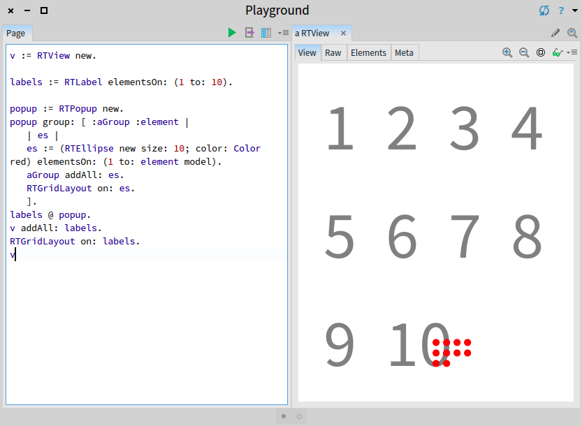
2. Popup
A popup is a contextual information that appears when the mouse is above an element. The information is removed when the mouse leaves the element. Adding the expression es @ RTPopup makes the element react to mouse movements.
Without being configured, as it is the case with the expression es @ RTPopup, the popup content is directly generated from the model behind the pointed element. For example:
	v := RTView new.
	es := RTEllipse elementsOn: (1 to: 100).
	es @ RTPopup.
	v addAll: es.
	RTGridLayout on: es.
	v
Each circle represents a number. Pointing to an element using the mouse open a small number that indicates the pointed number. The popup may be configured in a number of ways.
For example, the following example shows different combinations of popup configuration:
	v := RTView new.
	es := RTEllipse elementsOn: (1 to: 100).
	popup := RTPopup new.
	popup alphaPopupBackground: 0.5.
	popup backgroundColor: Color blue.
	popup borderColor: Color red.
	popup textColor: Color orange.
	popup text: [ :object | 'Value ', object asString ].

	es @ popup.
	v addAll: es.
	RTGridLayout on: es.
	v
A popup supports multi-lined text. For example, you may insert a carriage return character in the text: instruction:
	...
	popup text: [ :object | 'Value = ', String cr, object asString ].
	...
3. Fixed popup
A fixed popup is like a popup, but it is located at the bottom left of the window. This is useful when the popup embeds a long text, or the popup negatively interferes with the visualization.
The class RTFixedPopup is a subclass of RTPopup, as a consequence, you can simply replace the use of RTPopup by RTFixedPopup to have a fixed popup.
4. Graphical popup
Examples given previously in this chapter use text as a popup content. A popup does not necessarily need to render text and may render any arbitrary visualization.
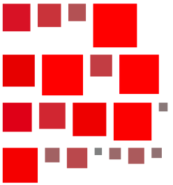
Consider the following example (Figure 4.1):
	v := RTView new.

	labels := RTLabel elementsOn: (1 to: 10).

	popup := RTPopup new.
	popup group: [ :aGroup :element |
		| es |
		es := (RTEllipse new size: 10; color: Color red) elementsOn: (1 to: element model).
		aGroup addAll: es.
		RTGridLayout on: es.
		].
	labels @ popup.
	v addAll: labels.
	RTGridLayout on: labels.
	v
The message group: takes as argument a block with two arguments. The first argument, called aGroup in our example, receives an empty group of elements. The block is intended to add elements in the aGroup variables. Those elements will be used by the popup. Layout may be applied.
Edges may be also added. Consider (Figure 4.2):
	v := RTView new.

	es := RTLabel elementsOn: (5 to: 100 by: 5).

	v addAll: es.

	es @ (RTPopup new
		background: Color blue
		group: [ :group :el |
	 		| elements |
			elements := RTEllipse elementsOn: (1 to: el model).
			group addAll: elements.
			RTEdgeBuilder new
				view: group;
				elements: elements;
				connectFrom: [ :aNumber | aNumber // 2 ].
			RTClusterLayout new
				verticalGap: 0;
				on: elements.
			]).

	RTHorizontalLineLayout on: es.
	v
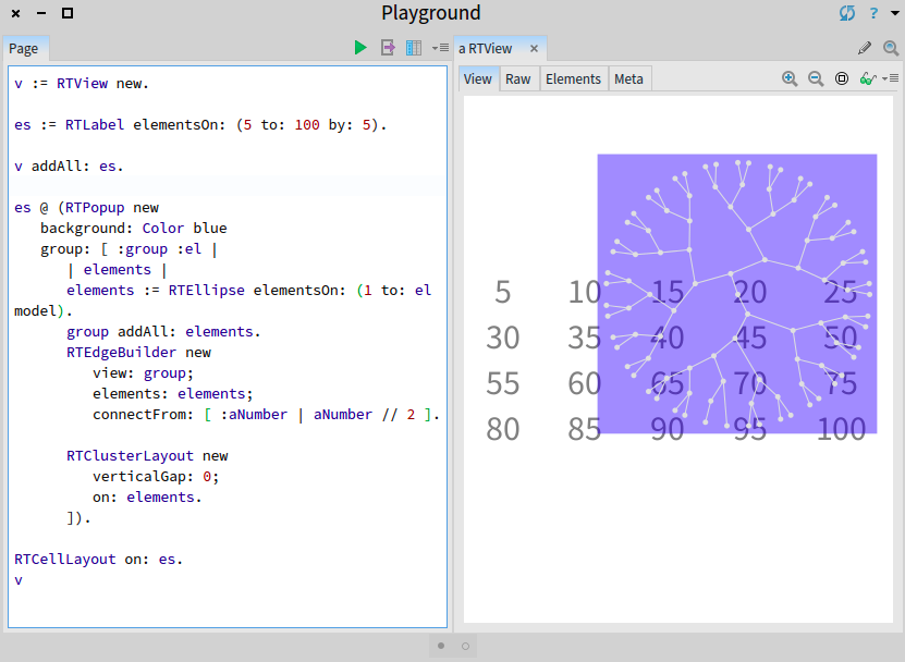
The edge builder is set with group as the view. This is where the edge builder will look into elements to link. Methods alternative to background:group: may be used, such as group: if the background is not necessary. A title is added to the popup by using named:background:group: as in:
	...
	es @ (RTPopup new
		named: [ :aNumber | 'Cluster for ', aNumber asString ]
		background: Color blue
		group: [ :group :el |
			...
			]
	...
5. Highlighting elements
Reacting to the mouse movement by highlighting related elements is a frequent need. The interaction class RTHighlightable is a flexible interaction to highlight particular elements. Consider the following code snippet (Figure 5.1):
	v := RTView new.
	es := RTEllipse elementsOn: (20 to: 70 by: 5) asArray shuffle.
	v addAll: es.
	es @ RTPopup.
	RTMetricNormalizer new
		elements: es;
		normalizeSize: #yourself;
		normalizeColor: #yourself.
	RTFlowLayout on: es.

	es @ RTHighlightable.
	v
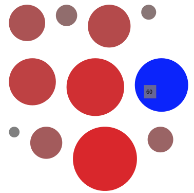
When the mouse enters an element, the color of that element changes. When the mouse leaves, the original color is restored. The default highlighting color is blue. It can be set using the color: message. For example, the following instruction es @ (RTHighlightable new color: Color pink) set the color to pink.
A set of object models or Roassal elements may be provided using highlight: or highlightElements:. Consider the second version of the previous script:
	v := RTView new.
	es := RTEllipse elementsOn: (20 to: 70 by: 5) asArray shuffle.
	v addAll: es.
	es @ RTPopup.
	RTMetricNormalizer new
		elements: es;
		normalizeSize: #yourself;
		normalizeColor: #yourself.
	RTFlowLayout on: es.

	es @ (RTHighlightable new highlight: [ :aNumber | aNumber to: 70 by: 5] ).
	v
Object models greater than the one on which the mouse is above are highlighted.
	v := RTView new.
	es := RTEllipse elementsOn: (20 to: 70 by: 5) asArray shuffle.
	v addAll: es.
	es @ RTPopup.
	RTMetricNormalizer new
		elements: es;
		normalizeSize: #yourself min: 5 max: 30;
		normalizeColor: #yourself.
	RTFlowLayout on: es.

	es @ (RTHighlightable new highlightElements: [ :element |
		element view elements select: [ :e | e trachelShape height > 15 ] ] ).
	v
Both highlight: and highlightElements: accept a one-argument block. The argument block as to return a collection of object models or a collection of Roassal elements, respectively.
6. Dynamically adding labels and edges
Labels and edges may be added as a kind of popup. Consider the following example (Figure 6.1):
	v := RTView new.
	es := (RTBox new color: (Color blue alpha: 0.4))
			elementsOn: (RTShape withAllSubclasses).
	v addAll: es.

	RTNest new
		for: es add: [ :group :model |
			group addAll: (RTBox new elementsOn: model methods).
			RTGridLayout on: group ].

	es @ (RTShowEdge new
				connectTo: #dependentClasses;
				shape: (RTLine new color: Color red);
				yourself).
	es @ (RTShowLabel new
				color: Color red;
				highlight: #dependentClasses; top; yourself).
	RTGridLayout on: es.
	v
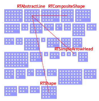
The interactions RTShowEdge and RTShowLabel are used. RTShowEdge defines some edges connecting to dependentClasses using the shape provided to shape:. RTShowLabel temporarily gives a label to related elements. In the example given above, the labels are located on the top of an element.